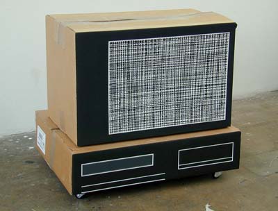
 "B&W chanel hop(p)ing", 2002 Kartonschachteln, Dispersion, Dimension variabel Claire Goodwin <TV-Dinner> Click for English text Die Britin Clare Goodwin (*1973) zeigt neue Arbeiten. Sie beschreitet als Malerin einen konsequenten Weg, bringt die Malerei jedoch auch immer wieder in einen installativen Kontext ein. So treten die BesucherInnen am Anfang der Ausstellung in eine raumähnliche Situation: Tapeten wurden auf Packpapier gemalt, ebenso ein vermeintlicher Teppich. Daneben steht ein Fernseh-Set aus Kartonschachteln. Auf den ersten Blick ein "heimeliges", vertrautes Bild. Erst beim genauen Hinschauen wird der "Fake" entlarvt. Diese Arbeit erinnert an Goodwins Serie "Un-plugged", bei welcher sie bekannte Werke der internationalen Videokunst aus Kartonschachteln nachbaute. Es sind vor allem die Interieurs der 60er und 70er Jahre, die in ihren Arbeiten vorkommen. Sie findet die Motive in alten Zeitschriften oder Katalogen und malt sie nach. So malt sie Küchenbilder in den verrücktesten Farbkombinationen; mal als Aufriss, mal aus der Vogelschauperspektive. Spannend ist der Grenzbereich zwischen Abstraktion und Gegenständlichkeit, in welchem die "Kitchens" anzusiedeln sind. Weiss man nicht, dass es sich um Küchen handelt, so wird man die Bilder eher zur abstrakten, konkreten Kunst zählen, ja, manchmal sogar zu reiner Farbfeldmalerei. Erfährt man jedoch, dass es sich um vereinfachte Darstellungen von Küchen handelt, so werden ebendiese stets auf den ersten Blick sichtbar. Es entstehen im Zweidimensionalen dreidimensionale Räume; die Abbilder sind eigentlich real existierende Küchen, wirken aber wie eine Art entseelter Idealvorstellung davon. Eine andere wichtige Serie nehmen die Fernsehbilder ein, bei denen Goodwin, das "Rauschen" des Bildschirms nach Sendeschluss malt. Und wahrlich beginnen die exakt aufgetragenen, farbigen (in den RGB.Farben) oder schwarz-weissen Raster vor den Augen zu flimmern, wenn man sie länger betrachtet. Neu malt sie auch Ausschläge von Oszillographen, was geheimnisvolle, verschlungene Linienstrukturen ergibt. Eine letzte Serie von Arbeiten ist dem Kitsch gewidmet, kleinformatige Reminiszenzen an Hochglanzmagazine oder von der Künstlerin selbst fotografierte Trouvaillen – malerisch meisterhaft und ironisch umgesetzt. Eine Ausstellung voller Malerei, einer erfrischenden Malerei, meist mit einer Prise Humor und Schalk. (Bernhard Bischoff) Ausstellungsdauer: 14.12.2002 - 1.2.2003 Öffnungszeiten: Mi-Fr 14–18 Uhr, Sa 11 - 16 Uhr Die Galerie bleibt vom 21.12.2002 - 4.1.2003 geschlossen. Galerie Bernhard Bischoff Hofstettenstrasse 6 CH-3600 Thun Tel: 033 221 75 05 Fax: 033 221 75 06 E-Mail: mail@bernhardbischoff.ch www.bernhardbischoff.ch Claire Goodwin Struck Dumb Clare Goodwin first made paintings of 1970s kitchens when she started art school, an attempt to recreate the security and comfort of the home she was missing. The cardboard TVs were based on a similar strategy, Goodwin's transferal of the peculiarly British focus on the television as the heart of the home – particularly for dinner-time viewing - into the unfamiliar environment of Sierre. Just as her inability to understand French or German were the obstacle to Goodwin watching TV in Switzerland, so her frustration with incommunication was the impetus for a series of works about language and its key role in a foreigner's negotiation with a new country. The courage of Goodwin's work lies therefore in her highly formal response to various experiences of being a stranger, conscious that intrinsic to the work she makes is its failure to fill the gap. In spite of their formal differences, the three areas of Goodwin's work are interlinked in numerous ways. In an exhibition in early 2001 the artist combined kitchen paintings with MDF containers, rendering the striped units on the canvas three-dimensional - supposedly a return towards the real subject of the work, but as unfunctional and stylised as her manipulated depictions in paint of a kitchen's dominant features. The previous year Goodwin had produced a walk-in kitchen painting for an exhibition, combining references to Claes Oldenburg's evidently hand-made replicas of consumer goods with the Cubists' tortured attempts to understand the relationship between the real and the depicted. For the current show in Thun, Goodwin is making a life-size installation that mixes hand-painted wallpaper and rug with a cardboard TV on an Ikea-type unit. The stark reductiveness of the paintings on canvas is transferred to this new work, which like the individual TVs, comments on the relationship between knowledge and perception. Goodwin develops this disjuncture between knowing about the world around us theoretically and actually experiencing it by making something new from the materials whilst maintaining their original banal identity. In the summer of 2001 for her exhibition in a Geneva appartment Goodwin deconstructed the kitchen, revealing the contents of the owner's store cupboard next to detailed replicas of food packaging. Her ironic supplanting of all the original designs with the green and orange of the Migros Budget range mirrors Goodwin's finely tuned choice of colours in the kitchen paintings, where the right tone of beige alongside a deep red or burnt orange immediately conveys 1970s taste in design. The real-life scale of the packaging replicas provides the same off-key familiarity of the paintings which are also life-size, having been projected from the tracings of the original photographs. Unlike the miniature versions that provide an overview of a kitchen interior, these larger paintings recreate a section of the room, inviting us to be enveloped by their immediately identifiable forms and functions, but also keeping us at bay with their geometric toughness and intimation of hygiene and order. The disjuncture between this controlled rhythm of lines that guides one around the surfaces and projections of a kitchen and the new free-hand detail of flower pattern surprises as much as Goodwin's recent paintings of pets and flowers, also "copied" from publications. Although one strategy is more about appropriating kitsch as comfort and the other demonstrates an attempt to extract the essential qualities of place, they are both concerned with confronting the impact of environment on our identity. The work on language that followed the TVs has, in turn, inspired a new series of paintings that abstract the unwanted images of television, the visual "nothingness" of the TV snow-screen and channel-hopping fuzz. Similar to Goodwin's dictionary that lists all the words that are identical in German and English, popular song titles translated into pidgen French and the New Dutch texts that present the artist's uninformed translations from English into German, her TV paintings convey the unfulfilled search for communication. Inspired in part by Nam June Paik's depictions of the frequency waves created by magnets on TVs, Goodwin's TV paintings are noiseless visualisations of the anxiety that ensues when we are unable to control the most banal of objects. Ultimately, all of Goodwin's work conveys an overwhelming sense of silence, a muffled static stillness that increases their power as images and concepts striving to develop a language that substitutes displacement with identity. (Felicity Lunn) |
|
|